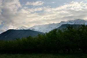
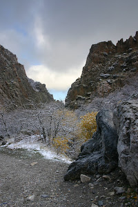
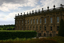
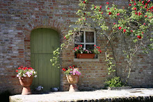
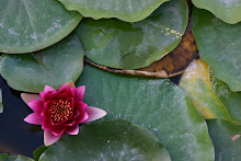
 For my Photography class we were supposed to shoot a landscape. So, one evening Kevin and I went up to a view point off Squaw Peak road and shot a few pictures. We lost light pretty quick because we were a little too late, but I got a couple good shots, most of them just look similar. But here are
  the two I think were best!


