I often get distracted when I get on my computer. I got on to quickly check and see if anyone had updated their blogs and to check my email. A few hours later and now my blog has been redone. I decided I really liked the look of a white background and the clean look. I have seen it on several blogs and thought it matches my style.
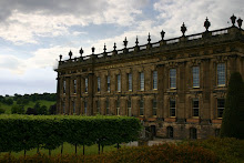
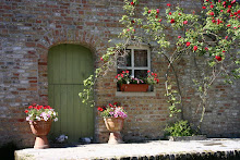
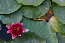
Just so you all know, this blog from now on will be mostly photos and projects. I will be taking several art classes this semester and will hopefully post the projects I do. I'll also post any new "artistic" photos I have taken (as opposed to photos of me and Kevin or something like that).
So, to read about my life you can visit my other blog, and to view my work you can keep visiting this one! Let me know what you think about the new look and any suggestions you may have. Thanks!
Tuesday, August 19, 2008
Subscribe to:
Post Comments (Atom)









3 comments:
Hi Cassidy, I really liked the way your blog was before, especially the cute photo at the very top! But this looks great too. I'll be checking back often, I'm excited to see your projects.
I love the new look of your blog! You are just amazing!
Nice to see a new post! I understand how long the re-design phase takes. White is quite a different look! I like the new header, but in the spirit of constructive criticism, I'm not a fan of the new bkg. But, Leilani, someone I work with, saw it and was like, "Oooh, who's this extraordinary photographer?" So there ya go, two opinions in one. Love ya!
Post a Comment